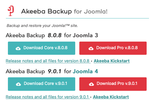
You mean like what we are already doing? Sure. Here it is, implemented since last Thursday, two days before we launched Akeeba Backup 9:

We are already showing you which download is for Joomla 3 and which one is for Joomla 4 and even put Joomla 3 first knowing that this is what most of our users will be looking for over the next year or so. We make it pretty clear, don't you think?
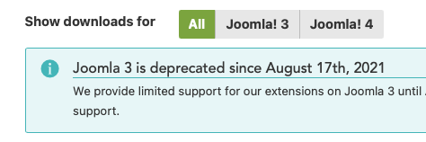
On top of that, right above the downloads, we have this handy Joomla version selection picker:

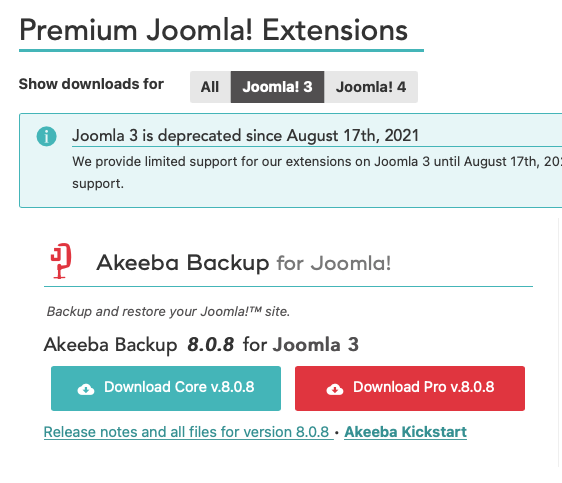
If you pick a specific version you only see the Joomla downloads for this version (as well as all non-Joomla downloads). So, if you select Joomla 3 here's what you see instead:

Before you say “Why don't you have a separate section / tab / page / whatever with Joomla 4 downloads” the reason is that people familiar with this site will NOT look for sections / tabs / pages / whatever. They will look for the downloads where they are used to them being the past 5 ½ years. If they can't immediately find the Joomla 4 downloads they assume they do not exist. Some will ask (they did during the beta and RC period of Joomla 4) and many more will simply make an assumption and abandon our software. I had someone email me that they are not renewing because we are supposedly not supporting Joomla 4, even though we were the FIRST developers to support Joomla 4 since it was alpha 2 (November 2017!) and it was yours truly who started the Joomla 4 project, writing its roadmap with my own hand on a piece of paper back in June 2015. I mean, you can't get anyone more committed to Joomla 4 than me. Right?!
Going back to the design, we had to put the Joomla 4 downloads near the Joomla 3 downloads for the reason I mentioned. The question was how. One idea was to have separate blocks, side by side but this made the downloads page unusable. It was actually the first round on the redesign and one quickly killed off. There were other ideas like tabs on each product's download box, showing versions depending on what you selected at the top Joomla version selection etc. All of them had downsides regarding discoverability and user confusion. What you see right now is not just a random arrangement, it's something carefully designed taking several factors into consideration not least of which is preventing user confusion.
Please, before coming here to tell me that I should do something please double check if I haven't already done it. Chances are I have and the way it's implemented is anything but random and user unfriendly. Heck, my wife is a User Experience designer. When I present her something which I think is a good idea but would confuse users she gives me the look and proceeds to tell me why it's not right. Have you noticed that the user-friendliness of our extensions has been constantly improving since late 2015? That's why. I'm now reaching the point where I can stop myself before implementing something user unfriendly before I start writing any code or very early in the implementation at the latest :)
Nicholas K. Dionysopoulos
Lead Developer and Director
🇬🇷Greek: native 🇬🇧English: excellent 🇫🇷French: basic • 🕐 My time zone is Europe / Athens
Please keep in mind my timezone and cultural differences when reading my replies. Thank you!
